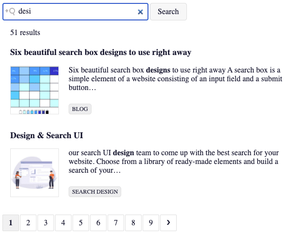
AddSearch Search UI Library consists of components you can use to create a search UI for your website. All components are visual, with dedicated functionalities and settings to modify their behavior.
You can use CSS and templates to modify how the components look and what information they contain. We will not focus on CSS in this article but suffice it to say you can use CSS to layout and style the components.
The templates define what information to show and how to organize the information in the component. Templates are useful when you have custom field data, for instance, prices, availability, discounts, and you want to display the information in the search results.
The Search UI Library works together with the Search API Client. The search UI Library is used for creating visual components for the page, and Search API Client is used to fetch the information displayed in the component.
In addition to fetching the search results, the Search API Client allows for configuring additional settings for the components. For instance, you can define the number of search results displayed on a paginated results page or configure the default sorting method.
This article gives you a conceptual overview of the components, the most used settings, and a brief look into templating. We will go through the component settings and related Javascript API Client settings, an example of a search UI that combines multiple components, and an example of what templating is.
- Search field
- Autocomplete
- Search results
- Sort By
- Pagination
- Load more results
- Filters
- Facets
- Active filters
- Segmented search results
- Templating
For detailed information on the AddSearch Search UI Library components, visit the reference pages at npm and GitHub.
To ensure you have the latest features and bug fixes, visit the Search UI Library repository pages at GitHub to see the change history.
For an overview of the settings, visit the Search API Client for JavaScript reference pages at npm and GitHub.
1. Search Field
The searchField component creates an input field that allows for entering search queries.
Visit the example page to see how the searchField component works in action.
The most common settings for the searchField component are placeholder, button, and searchAsYouType.
- The placeholder setting creates the placeholder text into the input field
- The button setting creates the button to submit search queries next to the search field
- The searchAsYouType setting enables the search-as-you-type functionality that executes a search query after each keystroke
The searchField component uses a default template you can override with your custom template.
By default, the search-as-you-type functionality uses fuzzy matching for typo-tolerance. You can enable or disable fuzzy matching using the Search API Client for JavaScript. For more information visit the references at npm and Github.
2. Autocomplete
The autocomplete component creates an element that displays search suggestions or search results after each keystroke.
Visit the example page to see how the autocomplete search suggestions works in action.
When the autocomplete component is set to display search suggestions, the search suggestions are displayed under the search field after each keystroke. After typing in the first letters the user can pick a search suggestion and use it as a search query.
Search suggestions are useful in mobile use where the typing experience is not optimal. Search suggestions also provide the means to guide the user towards the most searched and relevant content.
The search suggestions are based on searches made on your website or custom fields data. To use the search suggestions autocomplete, you need to enable the feature from the AddSearch dashboard before using it.
Autocomplete fetches search suggestions or search results data from the objects added to the sources array. The sources array can contain the following sources of data that are returned as autocomplete suggestions or search results:
- The type key fetches search suggestions or search results for autocompletion
- The client key uses a custom filter or search index to return search results
- Please note that you need to create a client instance to create custom filters or use other search indices
- The jsonKey uses the searchResults JSON as the source to return search results
The autocomplete component uses a default template you can override with your custom template.
You can set the number of custom fields autocomplete results with the AddSearch Search API Client.
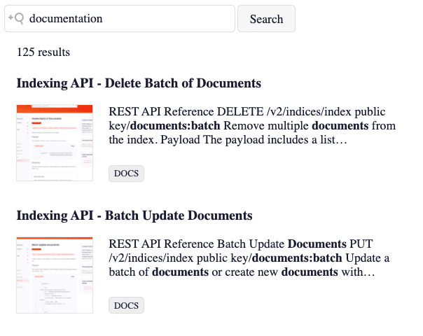
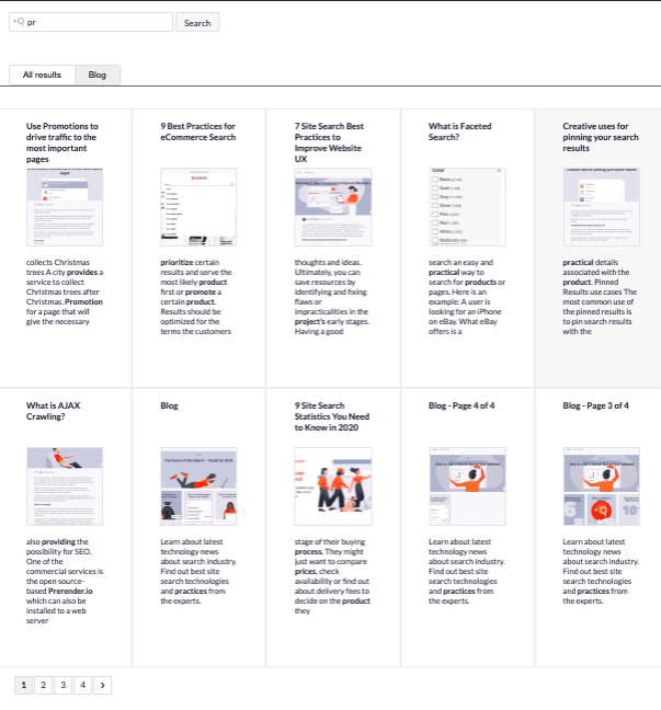
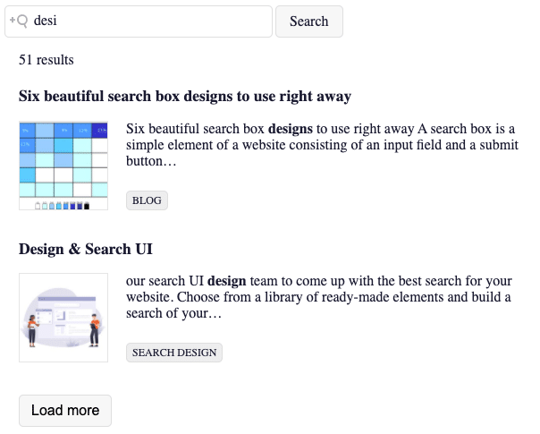
3. Search Results
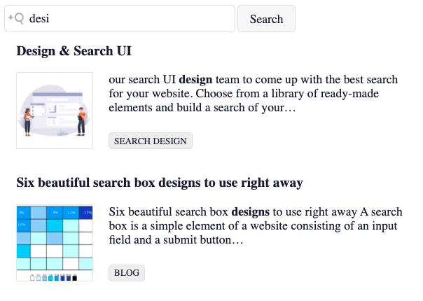
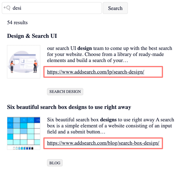
The searchResults component creates a list of search results as a response to the search query made with the searchField component.
Visit the example page to see how the searchResults component works in action.
You can modify the information displayed in the search results with a Handlebars template. Templates are useful, especially if you have custom field data you want to show in the search results, such as prices, availability, and discounts.
The default template displays a title, highlighted text, category information, link, and thumbnail. You can find the default template at GitHub GitHub. Adding the template code to your search UI source allows for overring the default template with your custom template.
For more information on templates and templating, please visit the templating section of this document.
Using Handlebars templates together with CSS styling allows for a wide array of possibilities for customizing the search results. For instance, you can display the search results in a gridview.
You can specify the number of search results displayed on a paginated search results page with the AddSearch Search API Client.
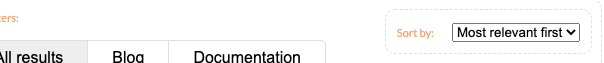
4. Sort By
The sortBy component creates an element that allows for sorting the search results by ascending or descending order based on dates, relevance, or custom fields data.
Visit the example page to see how the sortBy component works in action.
Sorting is useful when you want your users to find the latest, cheapest, or the most relevant products from your web page.
The sortBy component requires choosing the input type as a component setting. You can choose between two input types:
- The SELECT_LIST displays a list of options as a dropdown menu
- The RADIO_GROUP displays a list of as a group of buttons
Please note that both input types allow for choosing only one option at a time. Also, sorting by custom fields requires that the custom field’s data is an integer, double, or date.
The sortBy uses a default template you can override with your custom template.
You can configure the sorting of search results globally with the AddSearch Search API Client.
5. Pagination
The pagination component creates an element that displays the number of paginated pages for the search results. It also indicates the paginated page where the user is located.
Visit the example page to see how the pagination component works in action.
The pagination component divides a long list of search results into separate pages that contain a specific number of search results. It helps the user to consume the search results in smaller portions.
The pagination component uses a default template you can override with a custom template.
You can control the number of search results displayed on a paginated search results page with the AddSearch Search API Client.
6. Load More
The loadMore component creates a button below the search results that appends the search results with another batch of search results.
Visit the example page to see how the loadMore component works in action.
Like the pagination component, the loadMore component helps the user consume the search results in smaller portions.
The loadMore functionality is used in mobile views where the content is displayed and navigated vertically. A single button also provides a touch-friendly view compared to the pagination that contains multiple smaller interactive elements.
The loadMore component uses a default template you can override with a custom template.
You can control the number of search results displayed on a search results page divided by loadMore button with the AddSearch Search API Client.
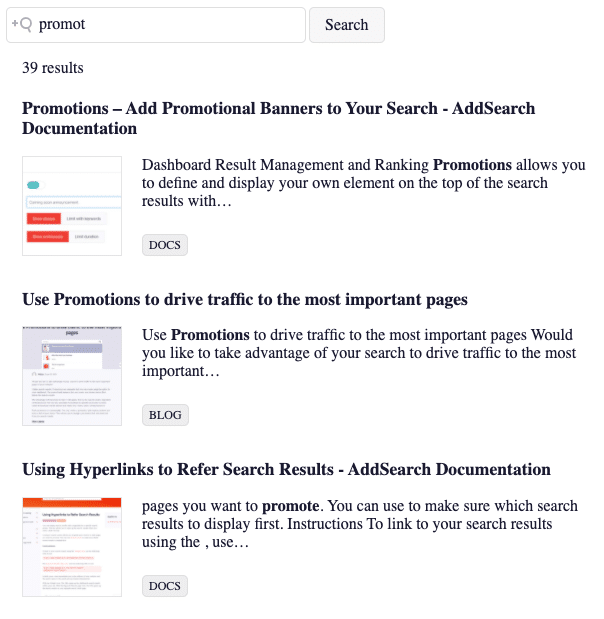
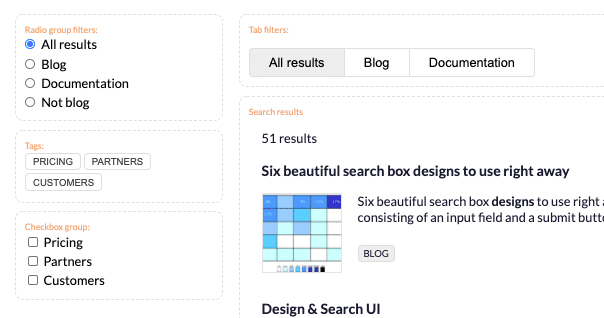
7. Filters
The filters component creates an element that displays a predefined set of filtering options for refining and navigating the search results.
Visit the example page to see how the the filters components work in action.
The filters component displays the options as elements from which the user can select multiple options or only one option at a time. For instance, a checkbox group allows for multiple selections, whereas a drop-down menu allows for selecting only one option at a time.
You can use search filters on content-heavy websites that require a method for narrowing down the search results, for instance, based on a particular category, brand, color, or price. Filtering is useful, especially in web-stores, where the filters help the user discover products with options to navigate the search results.
The filter component requires choosing a filter type. Some of the most common filter types are checkboxes, tags, radio buttons, tabs, and select lists.
- The CHECKBOX_GROUP displays a list of checkboxes with the possibility to choose from one or multiple options
- The TAGS displays a group of tags with the possibility to choose from one or multiple options
- The RADIO_GROUP displays a group of buttons from which only one button can be selected at a time
- The TABS displays a group of tabs that organize the results across different screens allowing for choosing one option at a time
Visit the reference page to see all the filter types.
You can use the clearOtherFilters setting to clear all other filters when the value of the filter changes. The clearOtherFilters setting works with radio group, select list, and tabs filter types.
The filtering options are defined in the options object that consists of the key, label, and filter.
The keys are global and a key name distinguishes one filtering option from another. You can use any name for the key, but you should choose a unique name for each key if you want to prevent triggering other options with the same key name.
If you use the same key name on multiple filters components, clicking on one option triggers other filters components’ options with the same key name.
Sharing the key across multiple filters components may be useful if you want to trigger multiple filters components’ options with different filter types with a single click.
Label defines the label of the filters component option on the page.
Filter defines the source used for filtering. You can specify the filters with URL patterns and custom field values.
The filters component uses a default template [link: https://github.com/AddSearch/search-ui/blob/master/src/components/] you can override with a custom template.
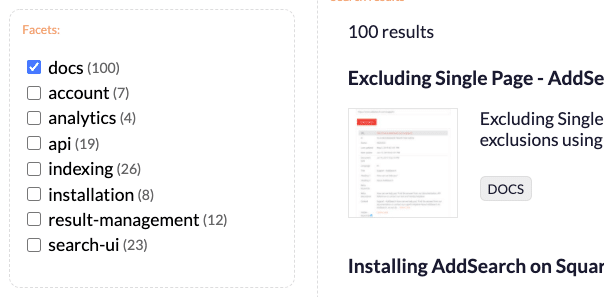
8. Facets
In the context of site search, facets refer to particular properties of a product or other articles found from a web page. For instance, the properties color, model, and storage capacity are facets of an iPhone in a product page.
Faceted filters are also called dynamic property filters because the facets are populated automatically and updated when the user interacts with faceted filters.
The facets component creates an element that displays facets as filtering options for refining and navigating the search results. Facets are populated automatically and updated dynamically when the user interacts with the faceted filtering options.
Visit the example page to see how the the facets component work in action.
The facets component displays the facets as a checkbox group from which the user can select facets as a filtering option to narrow down the search results.
When the user selects a facet filtering option from a checkbox, the checkbox group and the search results update either removing the checkbox group’s mismatching options or updating the number of matches next to the options in the checkbox group.
Faceted search provides the means to efficiently navigate content-heavy websites where the properties of products and web pages can be used as filters. For instance, a clothing store may have clothes from many brands with different sizes and colors that the user may find significant when searching for the best fit.
As the article on our website suggests, faceted search makes it easier for your user to find âthe needle in the haystackâ.
The facets component requires adding custom fields based facets to the client instance. Adding facets to the client instance ensures that the data from custom fields is fetched from the index.
After creating the client instances with facets, you need to pass them to the facets component as a field setting. Passing the facets to the component allows for fetching the custom fields data from the index.
The most common settings for the facets are field and sticky:
- The field setting defines which custom field values are used as the faceted filters
- The sticky setting displays number of facets next to the options
Visit the reference page to see all the facets settings.
The facets component uses a default template you can override with your custom template.
You can set number of automatically populated facets with the AddSearch API Client.
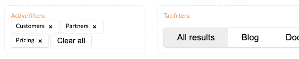
9. Active Filters
The activeFilters component creates an element that displays the filters the user has activated in the filter and facet components. When one or more filters are activated, an option for clearing all filters is displayed.
Visit the example page to see how the the activeFilters component work in action.
When the user activates a filter from filters created on the page, the activeFilters component displays the activated filters. The user can uncheck the activated filters one at a time or all filters at once with the clear button.
The activeFilters component allows for viewing all the filters with a single glance and deactivating irrelevant filters to widen the search’s reach. Clearing all filters gives the user a chance to start the search from scratch, for instance, when your user needs to search for an entirely different product from the website.
The activeFilters component uses a default template you can override with a custom template.
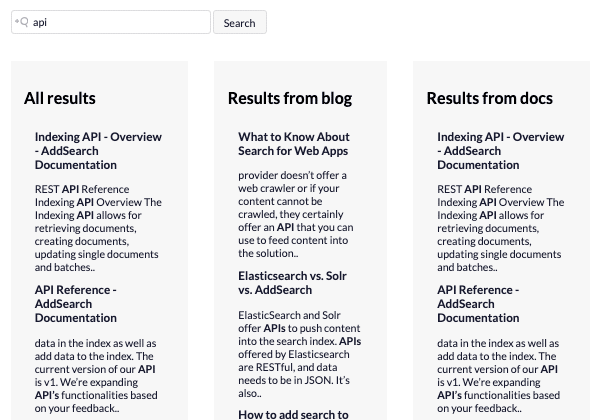
10. Segmented Search Results
Segmented search results is a search UI that simultaneously displays search results simultaneously from multiple search categories for a single search query.
In a segmented search, the search categories are divided into segments that can be displayed horizontally (next to each other) as columns or vertically (on top of each other) as rows.
Each segment consists of search results returned from different areas of a website, for instance, product pages, product reviews, and blog posts.
Like the searchResults component, segmentedSearchResults component creates a list of search results for a search query. Unlike the searchResults component, the segmentedSearchResults component requires setting up a client instance that specifies the site area where the search results are fetched.
Visit the example page to see how the the segmented search works in action.
The segmented search UI allows for multiple search results for a single search query. When the user makes a search query, two or more segments of search results are displayed on the screen. The segments allow for an instant overview of the website’s contents with a single search query.
One way of setting up a segmented search is to provide the user search results that provide additional and supporting information for the same keyword. For instance, a search query for an iPhone could have segments returning product pages with pricing and specifications, customer reviews, and blog posts about the iPhone at the same time.
Each segmentedSearchResults component requires a client instance that fetches the search results from the search index or a filtered area of the search index. The filters are set up with setFilterObject function that allows for specifying single and multiple filters.
You can also set the default sorting, the number of paginated page and the number of search results returned for the search query with the setPaging function. The segmentedSearchResults component also requires a handlebars template.
You can create the rows or columns for the segments with CSS styling and take advantage of layout methods such as Flexbox or frameworks such as Bootstrap to create the layout for the segments.
11. Templating
Each component has a default template that defines what information to show and how the information is structured. Templates are useful, especially if you have custom field data you want to show in the search results.
The AddSearch Search UI Library uses the HandlebarsJS library for templating. You can create a Handlebars template with HTML tags and add Handlebars placeholders with curly braces between the HTML tags.
You can pass objects, simple logical statements, and helper functions into the placeholders. The placeholders in the template are processed when the component executes. For instance, when the user executes a search, the placeholders are replaced with the field values fetched from the search index.
When you create a crawler-based index, AddSearch creates the fields automatically for each indexed web page. You can get the full list of the returned fields from the search API documentation.
However, if you use the indexing API, you can choose which information (which fields and values) to push into the index and use as values in the templates.
Modifying the Templates
As stated, each component uses a default template. You can find the link to each template from the AddSearch Search UI Library reference pages under the component settings.
You can use the default template as a starting point to get a better understanding of how the templates work.
To override the default template with your template you need to:
- Assign the template to a variable
- Pass the variable to the component as a setting
Removing Result Count
The default searchResult template displays the result count before the search results.
To remove the result count, remove the placeholder {{ numberOfResultsTemplate }} where the result count is set to appear (see the code snippet).
var myTemplate = `
<div class="addsearch-searchresults">
  {{#if resultcount}}
    <!-- {{> numberOfResultsTemplate }} -->
  {{/if}}

  {{#each hits}}
    <div class="hit{{#equals type "PROMOTED"}} promoted{{/equals}}">
      <h3>
        <a href="{{url}}" data-analytics-click="{{id}}">
          {{title}}
        </a>
      </h3>
      <div class="highlight">
        {{> searchResultImageTemplate}}
        {{{highlight}}}{{#not type "PROMOTED"}}…{{/not}}
      </div>
      {{#gt categories.length 1}}
        <div class="category">
          {{selectCategory ..}}
        </div>
      {{/gt}}
    </div>
  {{/each}}
</div>`;

searchui.searchResults({
  containerId: 'results',
  template: myTemplate
});
The result:
Adding target URL
To add the target page URL below the highlight text, add the url field below the highlight element.
var myTemplate = `
<div class="addsearch-searchresults">
  {{#if resultcount}}
    {{> numberOfResultsTemplate }}
  {{/if}}

  {{#each hits}}
    <div class="hit{{#equals type "PROMOTED"}} promoted{{/equals}}">
      <h3>
        <a href="{{url}}" data-analytics-click="{{id}}">
          {{title}}
        </a>
      </h3>
      <div class="highlight">
        {{> searchResultImageTemplate}}
        {{{highlight}}}{{#not type "PROMOTED"}}…{{/not}}
      </div>
      <div>
        <p>
          <a href="{{url}}">{{url}}</a>
        </p>
      </div>
      {{#gt categories.length 1}}
        <div class="category">
          {{selectCategory ..}}
        </div>
      {{/gt}}
    </div>
  {{/each}}
</div>`;

searchui.searchResults({
  containerId: 'results',
  template: myTemplate
});
The result:
Implementing Handlebars Helper
Handlebars helpers are Javascript functions that allow for processing the data from the fields of the indexed documents.
In addition to override the default template shown in the two earlier examples you need to:
- Create the helper function that processes the field data passed as a parameter
- Register the helper function to make it available in the template
- Add the helper in the template as a placeholder
Removing Title Ending
The default search results template displays the whole title of the indexed page.
In this example, we want to remove the ” – AddSearch Documentation” from the title. To do this
- create a helper function to remove the ending of the title:
function cleanTitles(title) {
    return title.replace('- AddSearch Documentation', '');
}
- register the helper:
searchUI.registerHandlebarsHelper('titleCleaner', cleanTitles);
- Add helper to the template before title:
var myTemplate =
`<div class="addsearch-searchresults">
{{#if resultcount}}
{{> numberOfResultsTemplate }}
{{/if}}
{{#each hits}}
<div class="hit{{#equals type "PROMOTED"}} promoted{{/equals}}">
<h3>
<a href="{{url}}" data-analytics-click="{{id}}">
{{titleCleaner title}}
</a>
</h3>
<div class="highlight">
{{> searchResultImageTemplate}}
{{{highlight}}}{{#not type "PROMOTED"}}…{{/not}}
</div>
{{#gt categories.length 1}}
<div class="category">
{{selectCategory ..}}
</div>
{{/gt}}
</div>
{{/each}}
</div>`;
searchui.searchResults({
containerId: 'results',
template: myTemplate
});
- To override the default template with the modified template, pass the variable to the component as a setting:
The result: