

The mobile market is booming. Recent years have shown a significant and constant rise in smartphone users globally. It doesn’t seem like this trend will stop anytime soon, either. As a Search-as-a-Service provider, it’s our job to provide the expertise and tools to help you create outstanding mobile searches for your websites and apps. Our ultimate goal is to increase your users’ satisfaction and, in turn, help you achieve your business goals. Let’s get the show on the road with our AddSearch mobile search boot camp!
Best practices for building mobile search bars
Let’s start by discussing the most critical aspects of designing and building a search bar. After all, this UI element is the first touchpoint visitors have with your search. Therefore, it should make an excellent first impression and blend in seamlessly with the rest of the design.
Make your search bar findable
It would be a shame if you invested time into building a great mobile search and then placed it so badly that users can’t find it, right? However, by following these recommendations, you can avoid this pitfall:
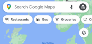
- Display a full-width search bar at the top of your app that is always visible. Google Maps is an excellent example of this:
- Place a magnifying glass icon in the tab bar of your apps. Users are quite familiar with this approach, so it should be a safe bet for most cases. Look at the following screenshot from Twitter to get an idea:

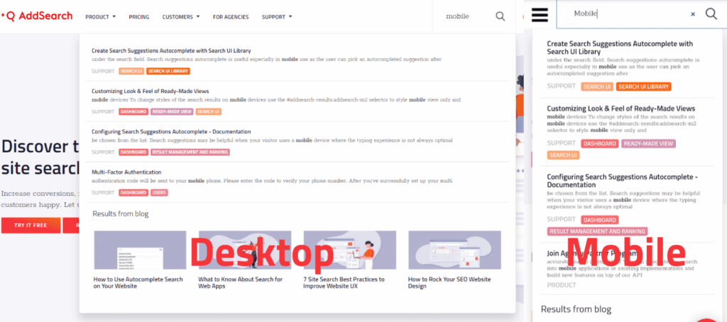
- Keep it similar to the desktop version. Suppose your desktop website displays search in the main navigation. In this case, it’s valid to do the same in the responsive version. Many websites use the hamburger button to toggle navigation visibility and display the search icon next to it. Here’s how we do it on our own website:

But which of the options should you choose as a search feature in your mobile app or mobile website? On the one hand, it depends on the design of your website or app. That said, the search bar and icon should match the site’s size, content, structure, and type. For example, a recipe blog might do better with a responsive design search than a full-width search bar. On the other hand, you need to consider the role of search in your use case – is it a vital action or just a helper? The more important the search, the more prominent you can place and design it.
Make your search easy to use
Designing the search bar is often not the best time to get overly creative. We recommend using patterns and UI elements that users are already familiar with. For example, did you notice that the examples above use the magnifying glass icon? That’s because web and app users recognize the symbol’s meaning as soon as they see it. If you choose to use text instead of icons, write something simple like “Search,” and you can’t go wrong.
Also, try to make the act of searching as simple as possible. Is your search quite complex? Then offer some helpful hints. Do you have a lot of different content? Give users search examples. Depending on your use case, you can develop additional ideas to make the search process more comfortable and enjoyable. For example, the music streaming app Deezer and Airbnb display text in the search bar to help users get started with their search:

Offer autocomplete and suggestions to speed up the search process
With autocomplete, users only need to type a few letters and then get a list of suggested words that the site search engine believes are relevant to the user. From this, users can then select the appropriate suggestion and continue with their search.
As a result, users get to their destination much faster. Additionally, you reduce the occurrence of zero results caused by misspellings or unknown searches and synonyms.
A second proven technique to accelerate the search process and guide users to relevant content is to display suggestions. Depending on your use case and the mobile search solution you’re using, you have various possibilities:
- Showcase trending topics or other business-critical content.
- Leverage personalization to suggest content that matches your users’ past behaviors and interests. A famous example of this is Google’s search suggestions.
- Display the user’s recent search queries (search history) so they can explore the search results again.
Of course, you can also combine these options and also integrate autocomplete into this view. Remember, mobile space is a valuable resource. Therefore, always make the best use of it.
Best practices for displaying and fine-tuning mobile search results
After you’ve mastered the art of designing and building a mobile site search bar, you need to dive into the other half of the search process: viewing and optimizing search results.
Find the most suitable option(s) to display search results
Depending on your data, you might find it best to display search results in a map, text-based list, or image tiles. Perhaps you can think of more than one possible display option for your case. If you’re not sure what would work best, learn about your users’ preferences by conducting A/B testing or gathering feedback from your teams and customers.
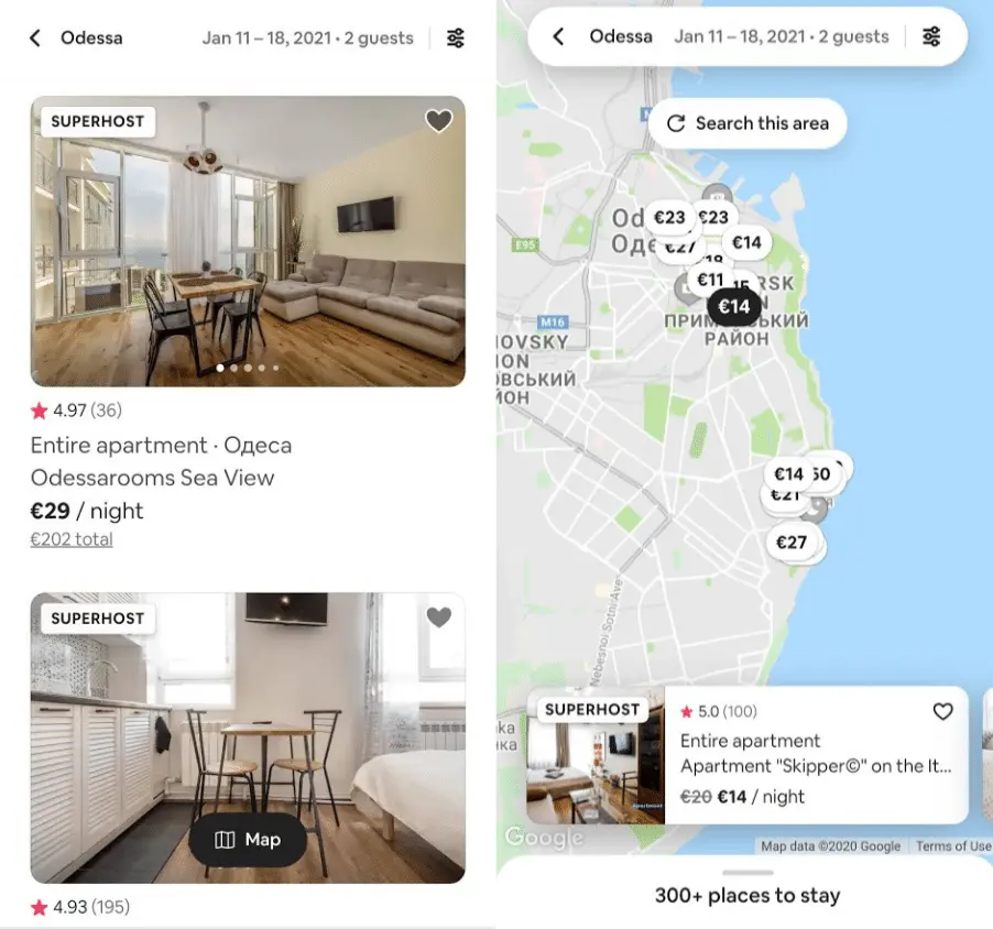
However, in some cases, you can support users to explore their results by offering them an alternative view. With Airbnb, for example, the user can switch between the classic list view and a map view:
If you have a small website with less content, you can often derive its mobile design from the desktop version. Below you can see our website’s search on desktop and mobile website which are very similar to each other:
Focus on viewing critical information
Naturally, the available space on mobile device displays also limits the amount of information you can display for each search result. Take your time to identify the key data, especially when you have a lot of different content.
With responsive websites, you may also need to reduce the amount of data you provide with each search result. Make sure not to display too much text so that the user doesn’t have to scroll excessively to see all of the results. Instead, only show specific data like the page title, category, and a thumbnail of the main image.
Let users optimize their search with filters and sorting
Filters and sorting functions are perfect for improving a search feature in mobile apps and websites. Users can find what they’re looking for even faster, which is particularly useful with large amounts of versatile data.
When building the filtering and sorting UI, you probably can’t just copy and paste the UI elements from your desktop version. Sure, the filters will most likely stay the same, but not necessarily. You have to adapt the filters to the available space and the touch surface. Many mobile apps and websites display filters in an overlay rather than above or next to search results. As you can imagine, that would be very impractical!
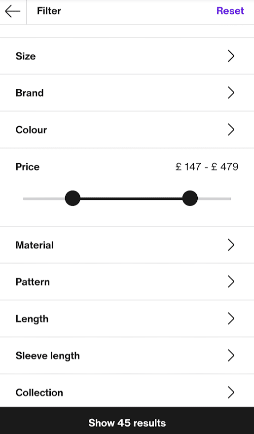
Next, you should make sure that UI elements like date pickers or range sliders are working correctly. The handles must be big enough to be pressed by larger fingers and must react immediately. For example, Zalando’s price range slider works as expected when touched, and the large handles make it easy to adjust the range:
We encourage you to look at various mobile apps and websites and try out the filters there. How do they work, and do they look or work any different from the desktop version? As a result, you’ll get a good idea of how to do things and what is not working so well.
What else to look out for
We’d also like to recommend the following pieces of advice, which we couldn’t place in the categories above. However, these points are no less critical for optimal mobile search:
- Make your website or app and search super fast, especially on mobile devices, because nobody likes to wait.
- Test your app and website under different network conditions: What if your native app loses its internet connection? How does a slow cellular network affect the overall performance of your app?
- Use known search UI elements and make sure the interface is accessible and responsive. Learn more about mobile accessibility and enforce a shared standard in your teams.
- Consider canary testing or A/B testing to find out what works best for your users. Alternatively, you can ask colleagues or your customers for feedback.
- Follow OS-specific interface guides for your mobile native apps. Look at Apple’s Human interface guidelines and Android’s Material design basics to learn more.
How to build your mobile search
But how can you build the optimal site search for your mobile website or app as smoothly as possible? Make sure you’re following the plan below, and you’re on the right track to mobile search perfection.
Step 1: Idealize, plan, and set goals
If you’ve already created a site search for your web application or website on desktop, you might be tempted to skip this step. But keep in mind that the mobile market presents new opportunities and challenges for your users and your business. Consequently, it’s a good idea to start with a blank page and do the research, planning, and goal setting again. If you’ve already gathered data on your mobile user behavior, see what you can learn and use your findings accordingly. Ultimately, you should finish with a concrete action plan on hand and have defined measurable goals for your mobile search.
The more complex your web app or website, the more time you may need to spend at this stage to develop the best search solution. Check out our blog post on measuring site search success and learn more about the planning phase and its components.
Step 2: Create wireframes and define mobile search capabilities
Now, with the plan you made in the last step, you can start creating something more tangible. Wireframing your mobile search is a great way to get a feel for the end results. Experiment and test your ideas and understand what features must be available and how to present them. Follow best practices, and don’t be afraid to take your time to iterate. The more precisely you work here, the less time you will later have to invest in changing components that have already been programmed.
Mobile Websites
When building the search for the mobile and desktop version of your website, we recommend a mobile-first approach. That means you design and implement the mobile version before starting the desktop version. As a result, you can ensure that your mobile search provides visitors with a great user experience.
If you’re working on the search’s mobile version and your desktop version is already ready, you may not want to spend any more time wireframing. However, we strongly advise you not to skip this step. Because if you just squeeze the search into your responsive design, you may be missing out on the chance to improve the UX of your mobile website. Through wireframing, you can discover hidden hurdles and develop new ideas to increase user satisfaction.
Mobile Web Apps and Native Apps
Think about how to make the most of the space available and how to deploy UI elements so that they work well and are accessible. You’ve probably already noticed that web apps and native apps often look similar. Some web apps were also created as a browser-based alternative to existing native apps. This means that your mobile web app is likely to have more in common with a native app than with a website. Use this knowledge to your advantage when looking for inspiration during wireframing.
One last thing that applies to native apps in particular: remember that you can use OS-specific, native UI elements. As mentioned earlier, Android and iOS have their own guidelines and recommendations for app layout and design. Hence, you can find dedicated wireframe kits for your preferred tool on the Internet, e.g., for Sketch.
Step 3: Implement your mobile search and UI
Finally, you need to make the wireframes a reality by implementing your search. How you can do this mostly depends on the search solution used. Let’s find out what your options are when building your mobile search interface with AddSearch.
AddSearch tip:
Naturally, before you can display search results, you need to fill your search index with content. We won’t go into further details in this blog post, as crawling and indexing content for mobile websites or apps is usually no different from the desktop versions. In fact, the mobile variant accesses the same search index in most cases. However, we’d like to point out that you can’t use web crawlers for native mobile apps. Instead, you have to manually push content into the search index using APIs. Would you like to find out more? Then check out our API reference.
Get quick results with ready-made views for websites.
We offer ready-made views with all essential search UI elements that you can comfortably integrate into your mobile and desktop website. They allow you to quickly set up a working and user-friendly search, making them the ideal solution if you’re looking for an immediate or temporary solution. However, our ready-made views offer only a few customization options. Thus, they may not be the best solution for web apps or your unique use case.
Our recommendation: the Search UI Library.
In most use cases, it’s necessary to create a search UI that integrates well with the rest of your website or web app. Our Javascript-based Search UI library is particularly handy for this. It enables you to build the ideal interface fast and securely and lets you stay flexible and scalable in the future. Frontend developers should have no problems utilizing the library to create tailor-made mobile search experiences.
Finally, using our library gives you a lot of freedom to customize and optimize your mobile search without having to pull data from the search index yourself.
If you’re looking for a simple but highly customizable solution for creating your search interface, we recommend opting for our UI library.
However, if you want to manually pull data from the index or develop a native mobile app, then working with our APIs is the way to go.
Do-it-yourself with our search APIs.
Retrieving content directly from the search index via our API gives you full control over the look and functionality of your mobile search. However, building the UI can be tricky and requires the right development skills and knowledge of search engines. Still, it is definitely doable, and you and your team will learn by doing.
If you’re unsure if this is the right choice for your mobile website or web app, we recommend testing our Search UI library first. Plus, you can always contact us if you need help implementing the search!
Also, be sure to check your available options when building a native app. There may be libraries or built-in UI elements and features that you can use to simplify implementation. For example, Android provides detailed documentation on building a search interface and retrieving data from an external search index.
Wrapping up
You made it to the end of our mobile search boot camp! We hope that your brain’s now filled with valuable information to confidently start working on your mobile search.
Remember to take your time as you plan your search and create wireframes. You can gain valuable insights to build a better search for your users during these stages. Also, make sure you choose a site search solution that fits your needs and is managed by a team of search professionals who can help you.
Do you have further questions about mobile search, or do you want to learn more about your options? Get in touch, and we’ll get back to you shortly.
