
Today’s websites need to offer better and more seamless digital experiences by the second. If your website isn’t optimized for UX and fails at providing seamless digital experiences to your users, it can negatively impact your success. But how can you keep up with your customers’ expectations?
We’d like to discuss seven major web design and UX trends that you should keep an eye on in 2025. Because if you regularly optimize your website, follow UX best practices and stay up to date on impactful web trends, your website can truly shine.
1. Offer Comfortable Colors and a Dark Mode
Due to the pandemic, more people are working remotely and might not go back to working in an office again. We spend hours and hours staring at our computers, having meetings via Zoom and the like instead of in-person, and organizing our social events online. After a day of staring at the screen, it’s not unusual to experience eye strain and fatigue.
Web designers are responding to the “Zoom fatigue” and now use color schemes that are easy on the eye and reduce back web design to do one task at a time. This web design trend already kicked off in 2024 with the popularity of dark mode. Most browsers and mobile devices can now toggle between light and dark modes, so you have to consider what your website design will look like with a dark color scheme in any case.
Users don’t want to have a disrupting color experience when they look at your website. Soft color palettes such as wholesome greens, pastel, blues, warm browns, or light pinks make your website easier to look at and naturally induce calm and relaxation. This website design trend gives hope that designers will be more concerned with comfort and overall user experience instead of focusing on drastic innovations.
Example
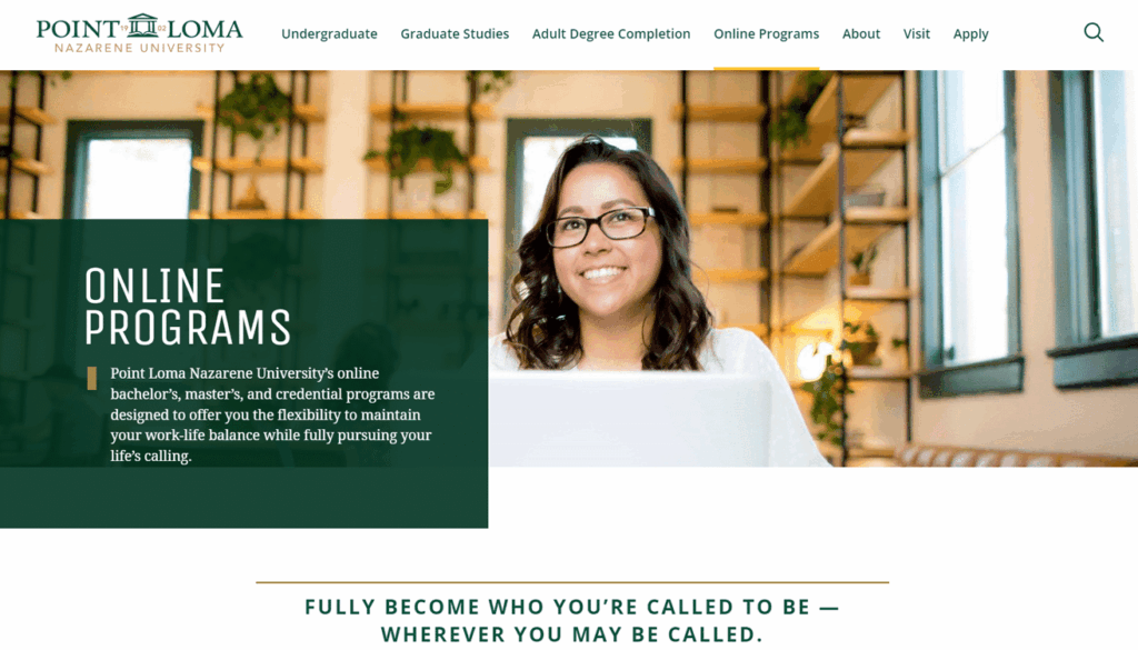
Point Loma Nazarene University is a private Liberal Arts college at the oceanfront in San Diego, California. They have around 3,500 students each year and offer smaller class sizes. Their mission is to help their students grow as a person and become engaged members of their community.
Their use of earthy tones like green, brown and cream, helps create a comfortable user experience.
2. Playful Cursors
What if viewing your page was a fun experience? Many modern websites now feature cursors that are playful and customized to one particular site or brand. This trend comes in many variations and can be as simple as changing the shape of the cursor or as complex as coding animations triggered by the cursor.
Introducing playfulness into your website will make your users curious and they can easily spend a couple of minutes exploring the uniqueness of your cursor icon. Having a unique element to your cursor will add another layer to your user’s experience.
Custom cursors are not a new trend, in fact, Myspace introduced them already in the mid-2000s in their profiles. But this is a comeback that brings new geometric shapes and custom coding. Repeating the colors or design of your logo in your cursor can also be a great way to incorporate your branding and engage your users with your brand by playing with the shapes.
Example
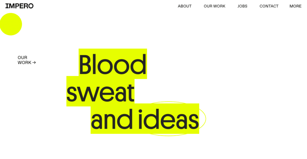
Impero shows how you can playfully integrate an unusual cursor. In their case, the yellow circle interacts with the website and lets you mark text. When you scroll over the navigation, you will see how the elements move according to the cursor. Just be careful cause you might end up searching all over the website for easter eggs and joyful ways to use the cursor.
3. Use Animated Illustrations and Micro-Interactions
Do you remember the times when almost all creative and smashing websites animated with Flash? It was relatively easy to create these animations, and more and more designers filled their sites with fancy animations until it became too much for everyone to bear. Then the animations disappeared, making room for a more minimalist design approach.
Today, hardly any site uses Flash (Adobe ended their support for Flash players in December 2020). However, with the new browser technologies such as HTML5, WebGL, and WebAssembly, web designers and developers can stylishly reintroduce animations into the web.
Tell your story with animated illustrations
Illustrations are well-known and effective design elements that help grab your users’ attention. Add some movement and dynamism to that, and you can enhance this effect a lot. People are attracted to motion. After all, our physical world away from pixels isn’t still either, and movement feels natural to us. Thus, applying motion to your website and illustrations can bring your products and services to life and help you tell meaningful stories. The golden rule here is not to overdo it, so we don’t get into the same situation as in Flash times. Thus, make sure that your website’s performance doesn’t suffer and that your animations don’t overwhelm users.
Example
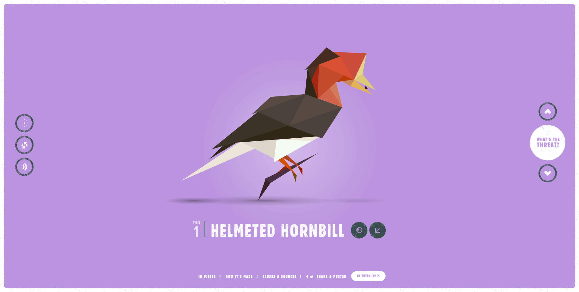
Species in pieces is a perfect example that shows what’s possible thanks to modern web technologies in the field of animation. The website skillfully uses animations and an appealing approach to educating users about endangered animals on our planet. All of the animals consist of animated shard-like pieces – without the use of images or videos.
Create seamless experiences with micro-interactions that blend in
Micro-interactions help you intuitively guide users through your website and give everyday UI interactions a well-rounded feel. You sure have noticed these little animations when you press a button, move the mouse over an image, or scroll through a website. Often, these interactions are so subtle that we aren’t aware of them. However, if these micro-interactions were removed, we’d definitely feel that something was missing. Although the topic appears to be a mere detail, it would be wrong to underestimate the power of subtlety. Micro-interactions can greatly improve your website’s user experience if they integrate seamlessly with your design, user interface, and other animations.
Example
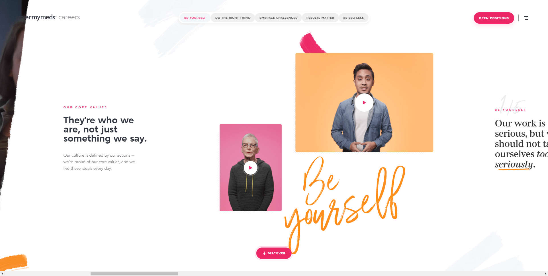
The first thing that catches our eye is that the content of this one-pager from CoverMyMeds runs horizontally. While scrolling, some of the visual elements move slightly, giving the user a sense of liveliness. Also, note the micro-interactions when hovering your mouse over videos, navigation items, and buttons. As pointed out above, subtlety is key. The designers of this website skillfully utilized micro-interactions to create a seamless experience that fits well with the brand and unexpected scrolling direction.
4. Bring Real-Life Experiences to the Display
3D graphics are another great way to bring real-world feelings to your website. In contrast to simple 2D images, 3D graphic renderings can, for example, allow users to engage with your products and services in an interactive way, creating an unforgettable experience.
During COVID-19 we experienced a time when we had to change our shopping behavior drastically due to lockdowns and curfews. By giving customers near-real-world experiences with your products, they can regain some of the familiar and missing shopping feelings. Ultimately, you can create something eye-catching and unique with 3D elements, as there is still plenty of room for exploration and growth in this area.
Creating 3D representations of your products or services takes some skill and time. But as you will see shortly in our examples, there are other ways to bring the feeling of 3D to your website.
Examples
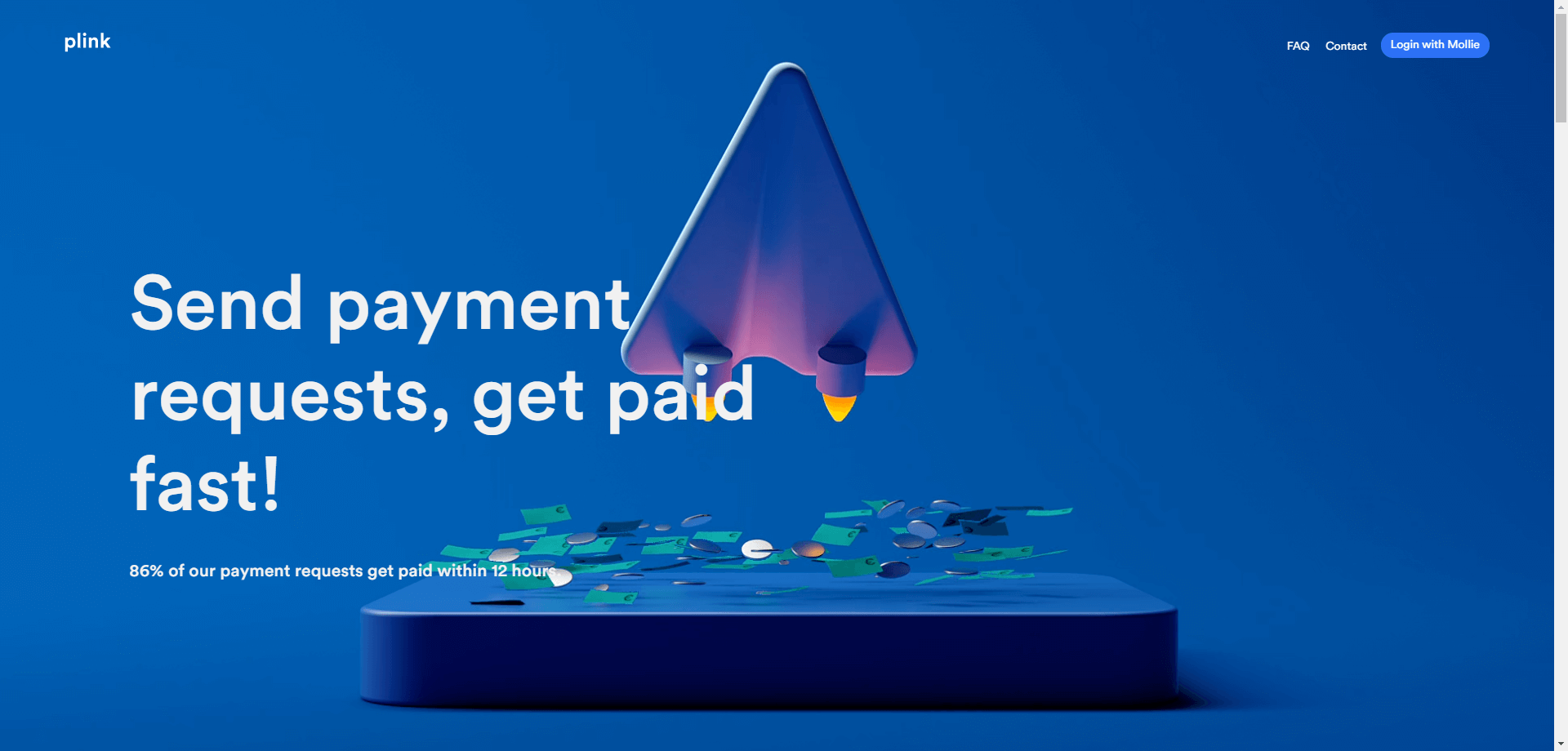
Plink is a digital payment provider that uses animated 3D graphics to create a modern and unique website design. The consistent and loving use of various animations and other design elements perfectly reflects how the company wants to be perceived by its customers.
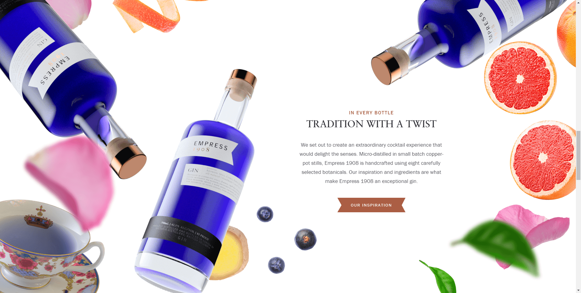
We also want to showcase a second example that follows a different approach. Empress‘s web design uses many quality videos and product photos. Naturally, these elements are 2D. However, as you can see in the following screenshot, the designers skilfully overlay photos with different sharpness to create the illusion of a 3D space. Real or not, what we see here feels like real depth for the human brain.
5. Expand Your User Base with Inclusive Design
Frankly, we don’t think inclusive design merely belongs to the web design and UX trends in 2025 – it should always be considered. As inclusion becomes more and more deserved attention in the physical world, we also have to bring the topic to our websites. We should not ignore certain target groups or groups of people when designing our websites. With inclusive design and accessibility, you not only do the right thing, but you also open up new opportunities for your company and help achieve your goals. Therefore, we recommend that you dive into inclusive design and web accessibility, learn about best practices, and make them an integral part of your website design and development processes.
What’s more, designing for accessibility and inclusion can lead to great solutions and UX design that benefit your entire user base. For example, think of voice search. Voice-assisted technologies not only help people with disabilities but can also ease processes and tasks for everyone. By researching and experimenting with new techniques that make your website more accessible, you can come across new innovative ways of doing things that can give you an advantage in the market.
Example
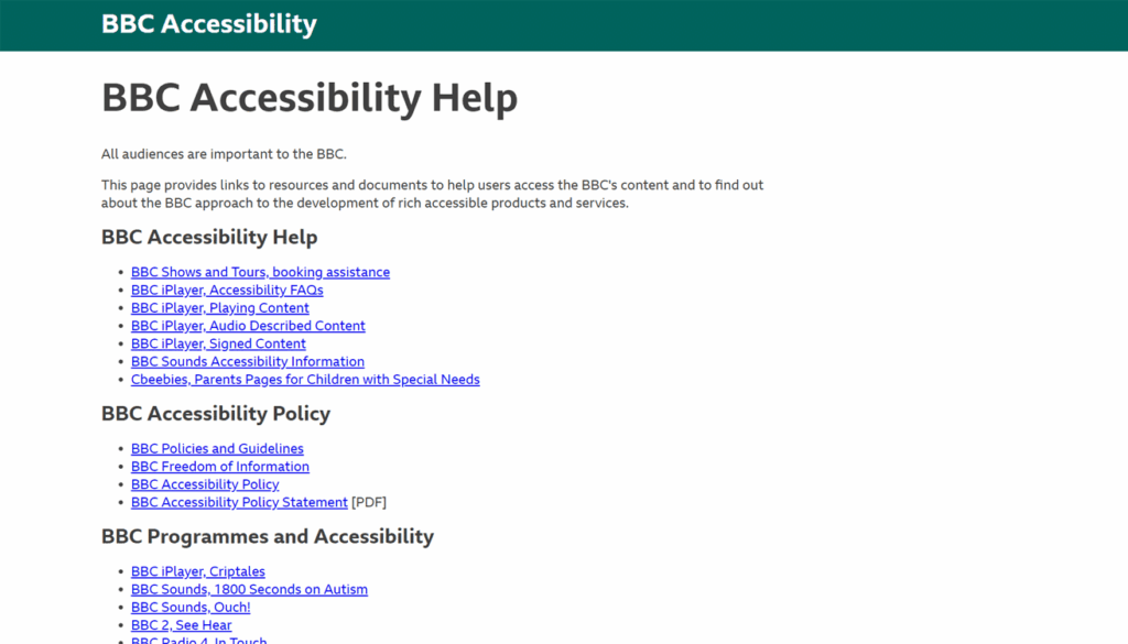
Users with limited mobility or fine motor control issues can navigate a website without a mouse using a keyboard, making it significantly easier. BBC News‘ website is a great example of how to accomplish this—users may click on and select every part of the page without ever touching the mouse.
6. Making Design Decisions Through Business Knowledge
What drives the digital realm? That’s right – it’s data. The collection and analysis of data help us improve our products and services as well as our websites and content. Different design methods and approaches such as design thinking or service design have long required designers to focus on more aspects than just aesthetics. In 2025, we can see that this trend continues, and it’s becoming increasingly important for designers to think a little more like business people. The combination of talent for creating great user experiences and understanding of the company and its users contribute to the creation of human-centered innovations.
Use data to create business strategies and financial models for your website that ensure that your idea creates long-term value. Business thinking also allows designers to see the bigger picture – not just the site but all the touchpoints between the company and its customers. It’s then possible to create seamless and unique experiences and back up design decisions with data. The days when only visual aspects determined the appearance of our websites are long gone. We started to ask questions more often: Why did we design elements of our site in a certain way? Is there a return on investment?
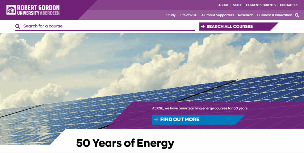
Example
Aberdeen’s Robert Gordon University is the top university in Scotland for graduate prospects, with an international reputation for management, health, energy & technology courses.
With the help of Data they recognized the need to implement an additional search bar to the Website to help users find courses more easily. This implementation helped Increase in Traffic to RGU’s Course Pages by 30%.
7. Storytelling and Writing for Humans
Valuable content and well-written copy that focuses on people rather than search engines play a vital role and have earned a place among the most important web design and UX trends in 2025. More and more companies understand that text is part of the design and should receive as much attention when it’s created.
Create enticing copy that speaks to your customers
It’s not a secret that good website copy has the power to turn prospects into customers by supporting users in assessing and identifying with products and services. Additionally, text can transport messages that design can’t (and vice versa), and you can make sure the user understands your mission, making your business more attractive and relatable.
Apart from that, we can also witness a more dialogue-like approach to written content. Even the most “boring” industries can spark joy and make their topics more exciting and appealing for their audience. Naturally, enticing copy requires a skilled writer who can work with UX designers to create a smooth interplay between visuals and text.
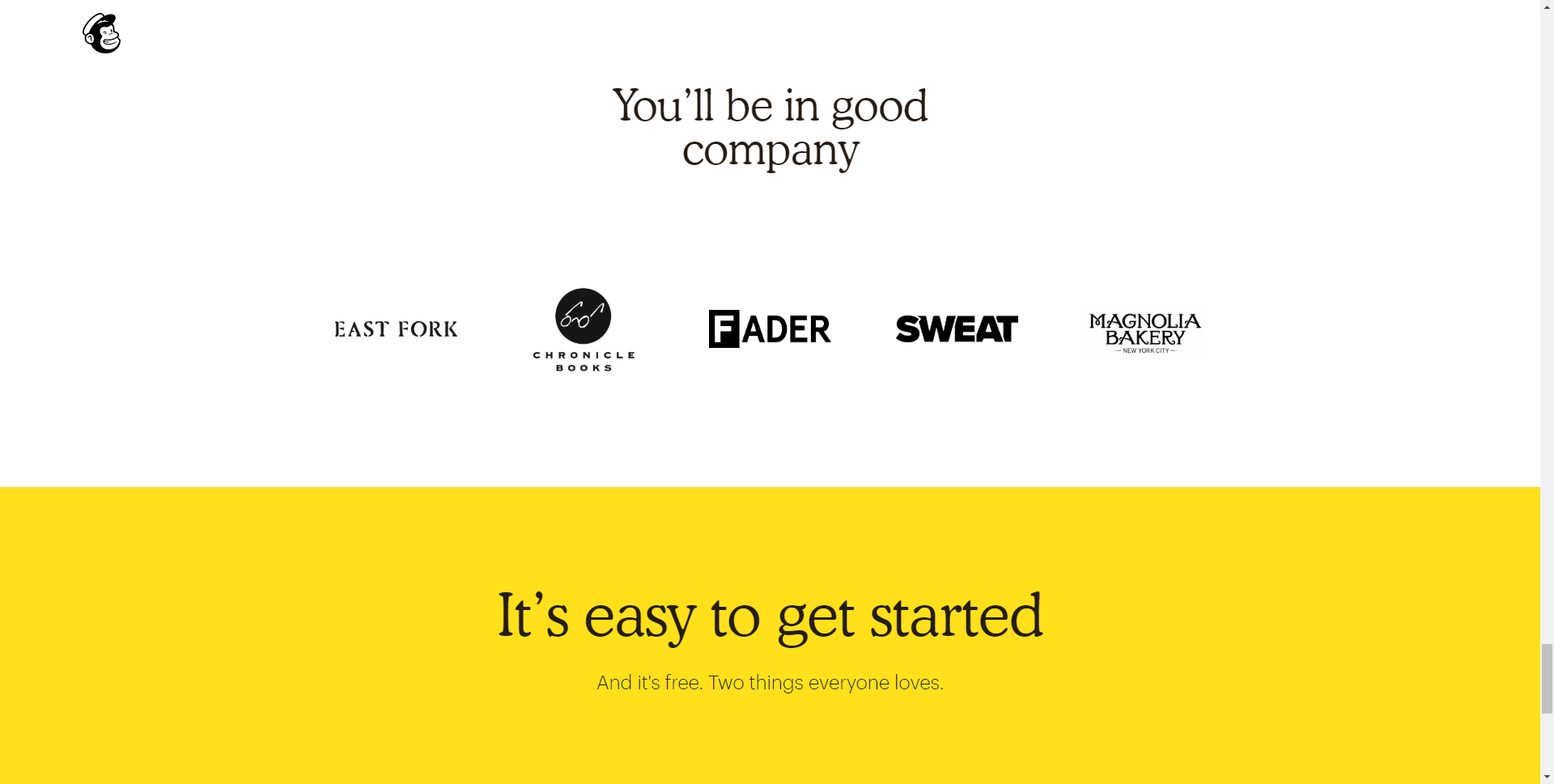
Example
Mailchimp‘s writers sure know their way around words. The company has a dialogue-like and authentic writing voice that makes it more straightforward for readers to identify with the brand. However, this isn’t a coincidence, and the company has probably spent a lot of time establishing and fine-tuning its writing style and creating a detailed and practical content style guide.
Tell stories to create unforgettable experiences with your brand
Storytelling has been part of humanity for millennia and is now a popular buzzword in the marketing industry. But many businesses still struggle with the proper execution.
Good stories don’t happen overnight. They require time, a lot of fine-tuning, and a team of writers and designers who appreciate the importance and value of each other’s skills. Combine design and copy to tell meaningful and exciting stories. Mix text with illustrations, photos, colors, typography, and animations to get your message across. Ultimately, your users will remember your company and product. Keep in mind that people love stories! We want to be part of what is told, and we like to remind us of the emotions they conveyed to us.
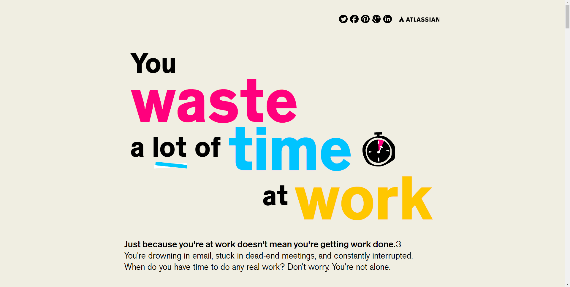
Example
On this one-pager, Atlassian skillfully uses storytelling with appealing design, eye-catching illustrations, and good writing to confront the reader with an everyday situation that they can identify with. Only at the end does Atlassian refer to their product (Confluence) as a solution to the conflict that they built up in their story. This example impressively shows how you can sell a product without constantly asking to buy through call-to-actions.
8. Personalized Content According to Your Geolocation and Browsing History
most modern websites track our browsing history and know our locations, this is no secret, and the newer generation of websites have evolved to advantage of that information and display dynamic content based on our previous user behavior. Not generic content made to serve everyone, but personalized information based on our previous buying, browsing history and our location.
Personalisation is a godsend for Ecommerce websites. When customers search for a product, they want to find an option that matches their needs and desires, and when they do, they are more likely to purchase.
Employees in a brick and mortar store are available on hand to help you find the items that suit your needs, and personalisation delivers similar results. Companies compete fiercely for users’ attention, and personalisation can be a lifesaver, helping you provide relevant content that reflects your users’ interests and preferences.
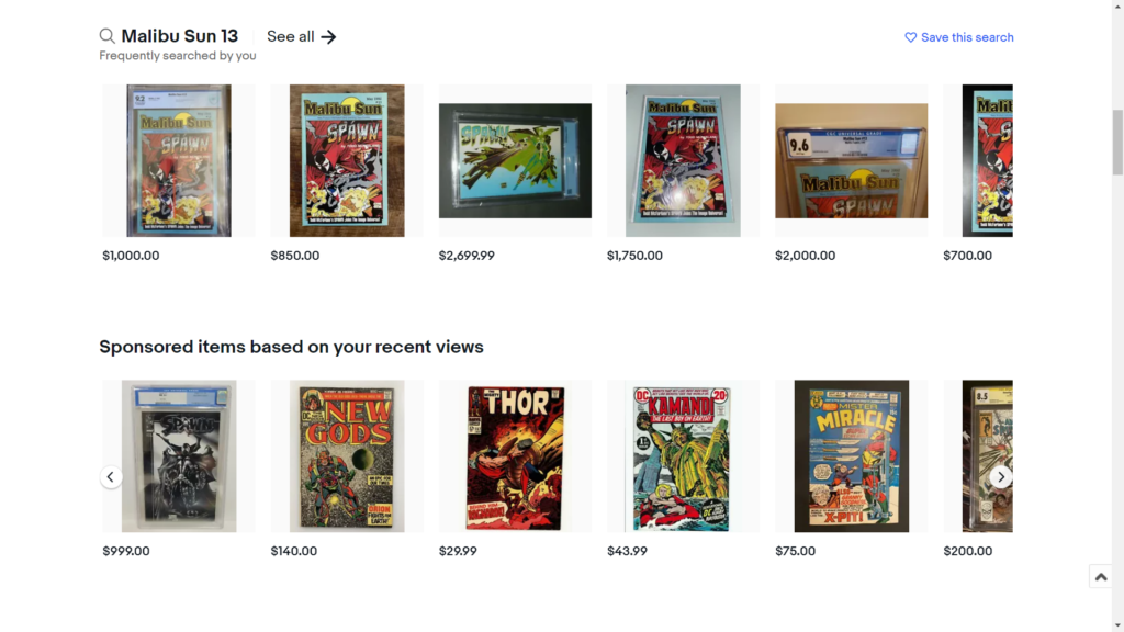
Example
Ebay is an excellent example of how user browsing history can be used to create a personalized experience, increase product discovery and prompt a user towards committing to a purchase.
9. AR and VR Integration
With sophisticated mobile phone availability becoming more commonplace, Inntigration of AR and VR experiences in websites will continue to rise over the coming year. We are already seeing successful projects being launched by sites like Airbnb that let you tour a rental before you book a reservation.
VR and AR can be a powerful additions to a website to serving to further enhance the overall user experience , providing content that is meaningful to a user and can assist in furthering the buying decisions.
Example
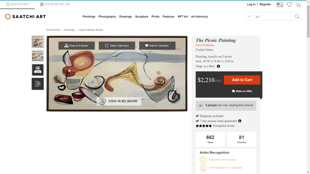
Saatchi Art is an online Art store and is a perfect example of successful AR integration to a website.
Thanks to Saatchi Arts integrated web AR feature, View in My Room, users can preview what paintings will look like on their wall before buying it.
10. Using Bold Fonts
Using Bold typography on a website is a trend that is rapidly becoming commonplace. Using bold fonts makes it easy to direct the user’s attention and makes them quickly aware of the message or information that needs to be conveyed. This directness has attracted many institutions to adopt this style to their websites.
Example
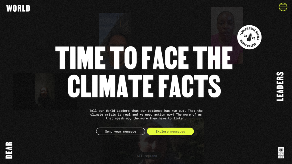
Dear World Leaders is an initiative by the UN Development Programme to raise awareness of the global climate crisis. Its website used text sparingly, but when used, it was presented dramatically, strikingly using bold fonts to create a sense of urgency, helping drive home the seriousness of climate change. It was no surprise that this website won the People’s Voice award at the 2022 Webbys.
11. Full Height Homepage Hero
Evolving web technology now allows web designers to add some extra flair by including interactive 3D elements to web pages. These 3d elements can help users get a feel of the brand’s personality and, as in most cases, interact with a virtual representation of a brand’s products.
Example
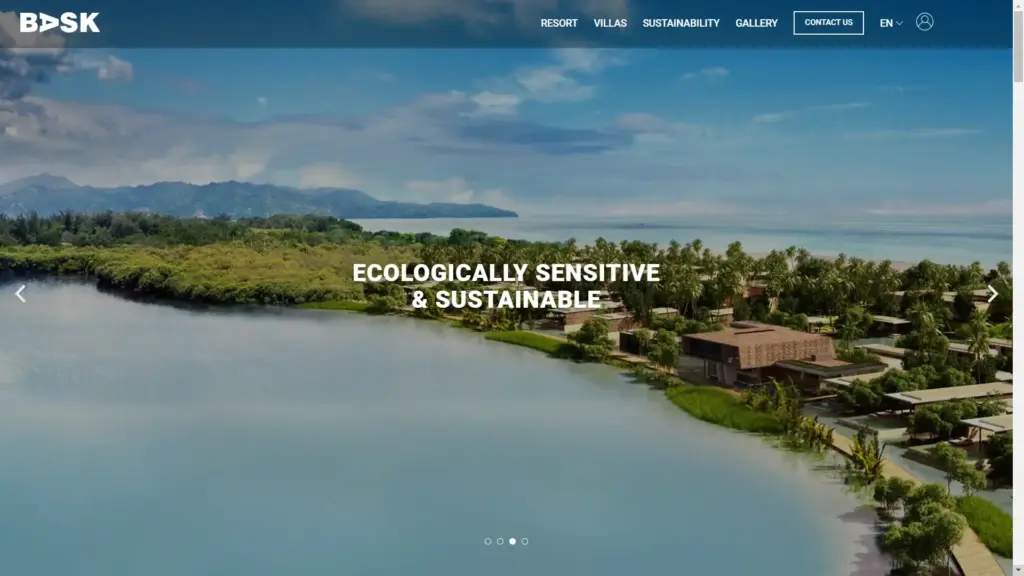
BASK successfully uses its website’s hero images and elegant headline texts to quickly reinforce and convey the different selling points and features of the company’s beach resorts to its website visitors.
12. White Space
The purpose of white space on a webpage is to allow content to breathe, not to jam as much material as possible onto the page. It also helps the site’s content stand out better and provides website visitors with an enjoyable and comfortable web experience.
Example
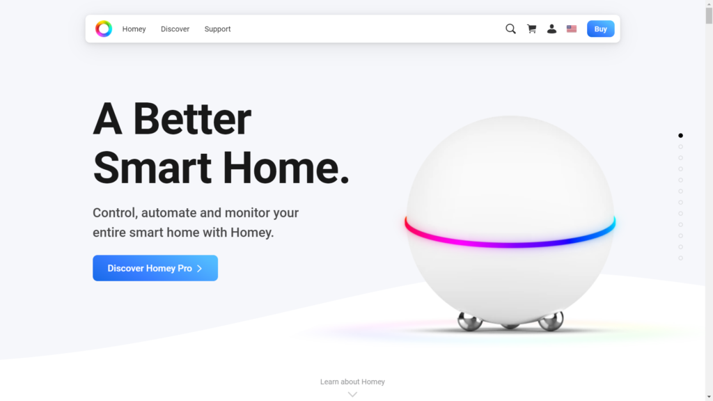
Homey’s website is a prime example of using white space to provide an exceptional user experience while prominently highlighting the brand’s service and products.
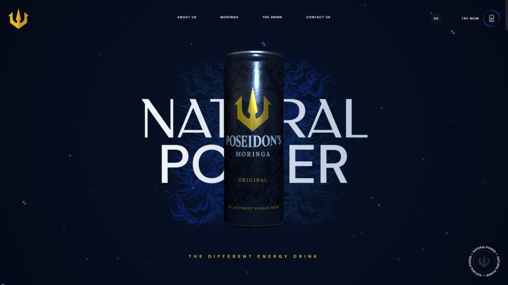
13. Creative Scrolling Experiences
Interactive scrolling animation provides an interesting new way for designers to challenge convention by making the act of scrolling itself entertaining for the user. Because scrolling is the most frequent form of engagement on a page, scrolling interactions can serve as a constant source of interactive feedback to the user. In 2025, visitors will be taken on imaginative journeys as scrolling experiences become more prominent than ever before.
Example
Poseidons, a swiss energy drink company, cleverly incorporates a scroll interaction into their website in the form of their energy drink can. The scroll interaction helps playfully highlight the energy boost the drink offers and its different flavors.
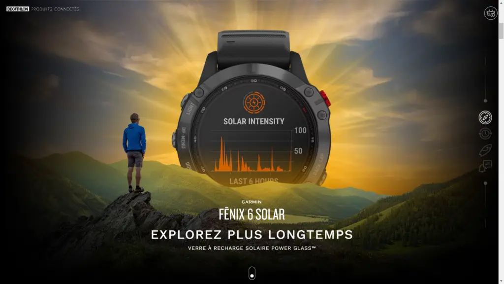
14. One Page Websites
Sometimes the simplest of websites tend to be the most effective. One page websites try to embrace this ethos by forgoing traditional menu-based navigation and favouring simple scroll navigation.
When you visit these sites, you get the feeling of holding a flyer or reading a poster. Information is provided in one place without the hassle of navigating or searching across pages; everything you need to know and understand is presented to you neatly on one scrollable page.
Example
The Garmin Fēnix 6 mini-site helps promote and acquaint site visitors with the solar-powered smartwatch’s features and selling points through a visually driven single page web experience.
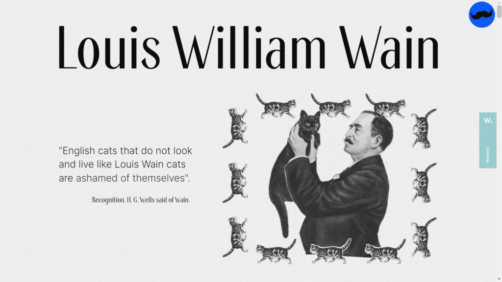
15. Collage Style Graphics
Collage style graphics is fast becoming popular among site designers; it gives site illustrations a tactile feel, opens up white space in a design, and allows you to incorporate many images without focusing the entire design around a single image. It also helps make a site look less technical and more organic, humanizing the experience of the website.
Example
Cats-louis.ru offers a whimsical and loving homage to the eccentric English artist Louis William Wain. The site successfully uses collage stylistically to celebrate Louis’s art’s whimsy and childlike glee while also narrating the artist’s story.
Wrapping up – the 15 major web design and UX trends in 2025
What was your experience with these web design and UX trends for 2025? Are you already working with some of these elements, or are you planning to do so? Hopefully, you’re as excited as we are about how these trends will shape the web and what new achievements we can look forward to in the coming years. We also published a blog post on site search in 2021 that we recommend reading if you want to learn more about this year’s web trends.
