
What Is site search data?
Every time your customer interacts with your website, you are presented with a treasure chest of opportunity. Each search your customers perform also generates a wealth of data, like which keywords they used, which results they clicked, when they searched, and so on. Used correctly, this data is the key that can unlock your ability to refine your offerings, have more meaningful interactions with your customers, and grow your revenue. AddSearch Product Director, Utku Yazici, explained in his LinkedIn Live how to make your site search data work for you. You can watch it on LinkedIn for more detailed insights on interpreting site search data and putting it to work.
Site search data basics: click-through rate and average click position
When you start trying to analyze your site search data, you will encounter several statistics, but there are two particularly important terms to pay attention to: click-through rate (CTR) and average click position (ACP).
Click-Through Rate (CTR)
The click-through rate is the ratio of the total number of clicks to the total number of searches.

The higher your click-through rate, the better. When someone searches for something on your website, they get a list of results. The click-through rate tells you if they actually found the results useful. If they didn’t click on a result, that means they didn’t find what they wanted, but if they do – they (and you) hit the jackpot! The more people click on the results and go to the corresponding page, the higher your click-through rate will be.
To make it simpler, let’s look at an example.
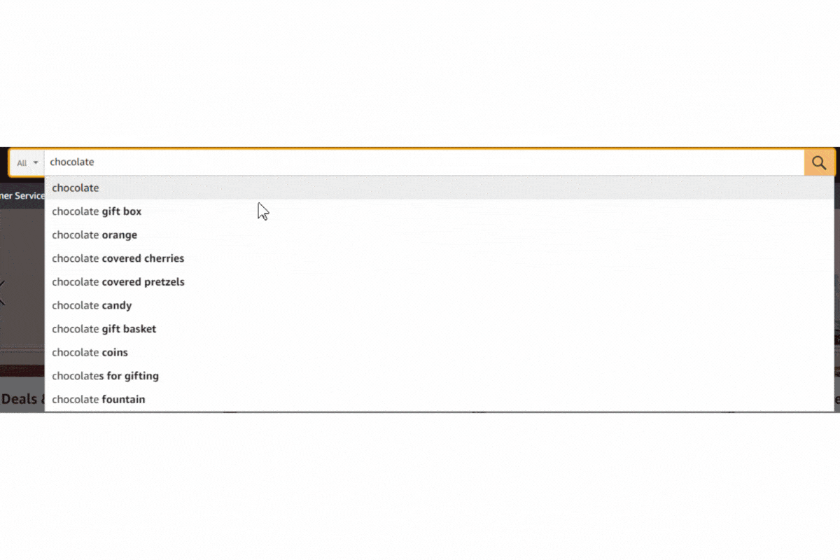
Five people go to a hypothetical e-commerce site searching for chocolate. They click search and get the results. If they each performed a search, there were five searches in total. Two of them clicked on the first result, and two clicked on the second result.

How would we calculate the click-through rate?
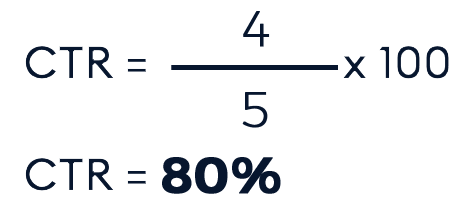
We had five searches, and four clicked on results, for a click-through rate of 80%.
As an industry standard, 80% and above would be a good click-through rate. A low click-through rate gives you information about your overall search relevancy. If people don’t even click the search results, that is a serious and significant sign of a bad search experience.
Average Click Position (ACP)
The other essential term is average click position, which is the average position of clicked search results.
For this, smaller values are better.
So, how do you calculate the average click position?

let’s look at an example scenario. Let’s say we had two clicks on the first result and then another two on the third result:

Our average click position, in this case, would be two. It’s a numeric value, so although there are no actual clicks on the second result when it’s averaged out between the first and third results, you get the second result. With ACP, the smaller, the better. If you have an average click position of five or six – or even any number bigger than three, it means people have to scroll down the page to find the results that show what they’re looking for. This is a bad experience since the relevant results are not at the top of the search. Visitors having to scroll lowers your search relevancy and click-through rate.
We’ve covered the most fundamental metrics for making your site search data meaningful—CTR and ACP. Now, let’s examine how the AddSearch analytics dashboard works.
Diving deeper into search data: the AddSearch analytics dashboard
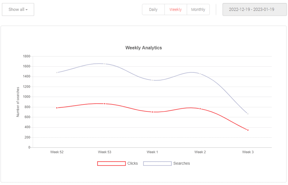
Daily, weekly, and monthly views
The main overview of the dashboard is categorized into daily, weekly, and monthly statistics. The daily view helps you track the changes that take place on your site on a day-to-day basis. For example, if you get surges in the number of searches during the weekends, then you would look closer at what is driving your website’s performance on those days.
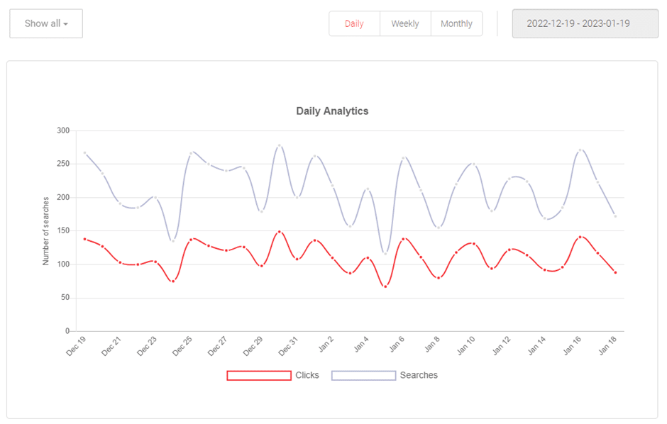
Weekly numbers consider week-on-week performance. If your site is for a university, you might recognize that there was a high number of searches during certain weeks in the previous year that coincided with the weeks when final exams were held. That might indicate that students were searching your site for the location of their final exams or other related information.
The monthly view, on the other hand, shows longer-term and seasonal trends like summer versus winter, Christmas versus Easter, and so on.
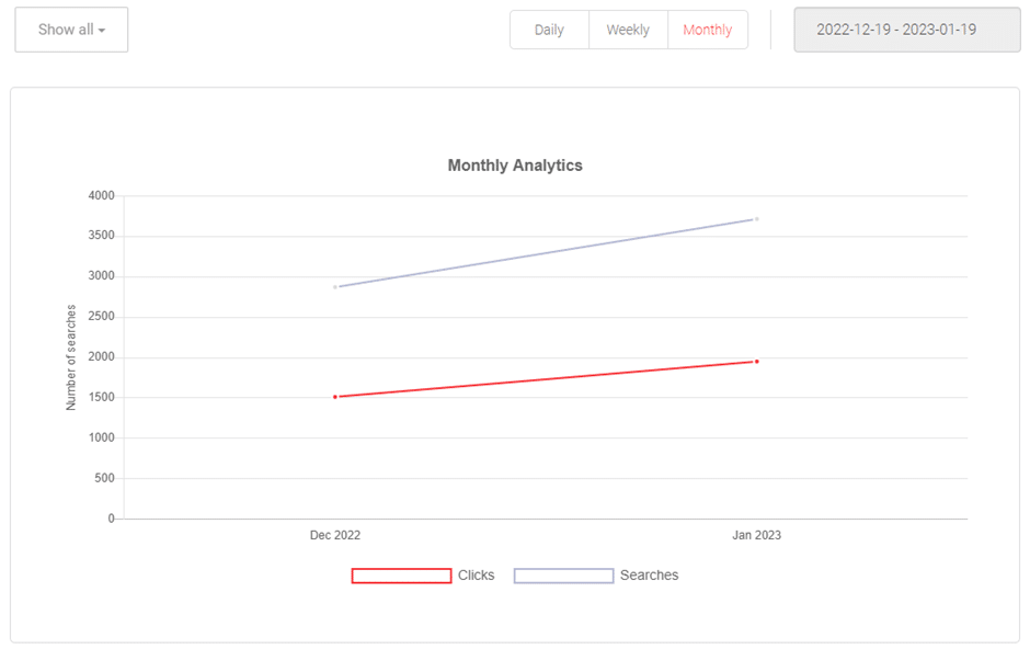
Switching between these timelines can be really helpful, since each gives you a different perspective. Based on the package you have with AddSearch, you can get from three to six months of site search data to show you what the trends on your website are.
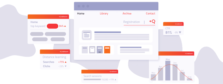
Quick Overview
We also have the quick overview. When you log into our dashboard, this information is one of the first things you’ll see. You don’t even have to click anywhere. It tells you at a glance how many searches were performed in the last 30 days.
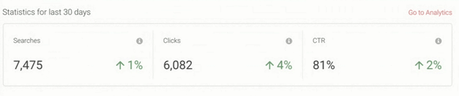
The 1% and 4% shown in the image compare your current search data with data for the previous 30 days. So, you can see that both searches and clicks are increasing. As shown here, the click-through rate is also increasing. Generally, this can be considered good performance.
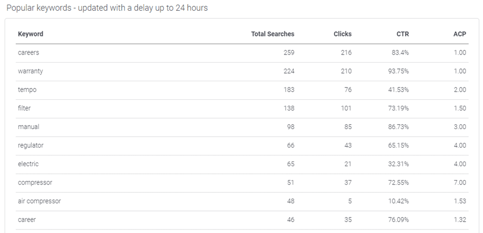
Popular keywords
Another useful feature is “popular keywords” for the last 24 hours. It tells you which keywords were clicked on most frequently, and how many clicks they got. You may want to know click-through rate and the average click position were, so you can understand how your search performed for those keywords. This view shows that too, so you can see what the trends in the last 24 hours were and whether you are covering those trends effectively. Once you see your data in detail, it may inspire you to take action based on that.
The “last 30 days’ keywords” overview gives you information not just about the last 24 hours, but about the last 30 days. This tells you which searches people have been performing as well as what they clicked on in the results, over a longer period. Then, if you find you have a popular keyword with a low click-through rate, it will show you that your visitors haven’t been able to find what they’re looking for.
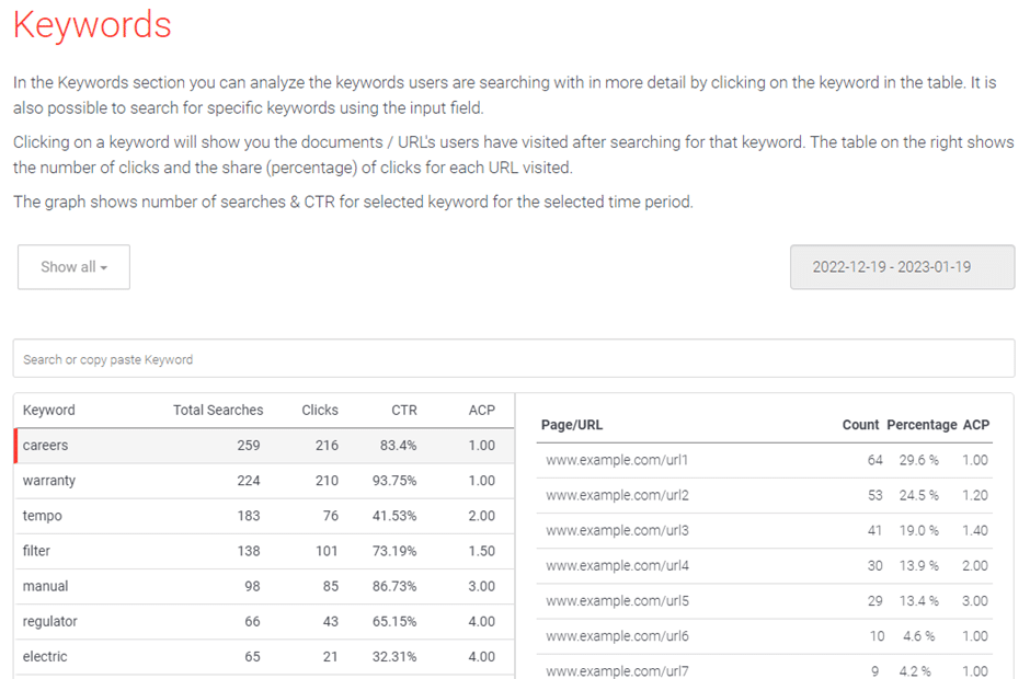
Fortunately, it also tells you they are looking for something they think should be on your website, and that gives you an opportunity to put it there.
Keyword-URL analysis
This keyword-URL analysis is where you can see the popular keywords again, but in relation to the URLs those keywords brought to your visitors to. You can then check those URLs have content relevant to the keyword.
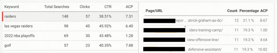
The inverse of that is also possible: the URL-to-keyword analysis shows you your URLs, and which keywords led visitors to them. If one of your pages was related to the NBA playoffs, for example, and people searching for the playoffs, the predictions, and other related topics land on this page, they are likely to be getting relevant content.
Downloading data to go deeper into details
All this data is downloadable and can be put on an Excel spreadsheet for a much more detailed analysis. As many users are comfortable with and skilled in doing data analysis on Excel, this allows them to create their own pivot tables and examine the data in the way that suits them best.
Integration with other data analysis platforms
AddSearch integrates with several data analytics platforms, like Matomo, Adobe Analytics, and Google Analytics. The most popular of those is Google Analytics.
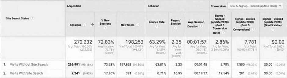
This image shows only a portion of the data that becomes available with this integration. But as is apparent here, pushing the data to Google Analytics gives you data related to sessions and bounce rates and conversions (however you define them in Google Analytics). It also lets you analyze sessions with or without search, so you can see how your site performs and measure the effectiveness of your search.
Integrating with this platform allows you to do many more things: check popular keywords, see how much people time people spend on the pages these keywords take them to, etc. So, combining session data, bounce rates, and conversion rate data with your search data can give you valuable insight into what is happening on your site. AddSearch allows you to access this insight quite easily, as you’re able to push data to Google Analytics automatically.
Analytics in action: case studies for using site search data
Let’s consider some use cases for the analytics data we’ve been discussing.
Weathering Hurricane Ian
During Hurricane Ian, a customer in the cruise business found they were getting a lot of searches related to the hurricane. People taking the cruises were, of course, worried about this hurricane and wanted more information.
What our customer noticed was that when people searched for Hurricane Ian on their website, the results led to a blog post unrelated to Hurricane Ian. To counter that, they created a page specifically on Hurricane Ian, listing the regions affected and the impact on their cruises, allowing their customers to find what they were really looking for.
Cooking with okra
Visitors landed on a customer’s cooking website searching for okra but did not click on any of the search results. This made the customer look more closely at the recipes on their website. They found out that there weren’t any relevant recipes for okra and decided to put some okra recipes on the site to engage their visitors better.
As you can see, data is useful, and it’s important to interpret it, but it’s what you do with the data that is important. You need to take action; you can remove a page, add a new page, or consider your overall strategy around search.
Automating data-driven actions
The examples we considered thus far have involved making your search or website more effective by taking action or making changes based on data that indicates something is wrong. Now let’s see how you can get your search to do the work for you.
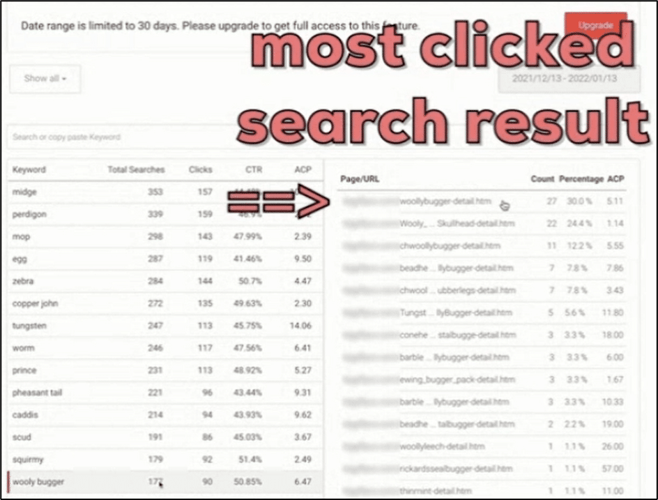
In the image above, the most clicked URL for the keyword selected has had 27 clicks, but its average click position is a little more than five. Although the number of people clicking on this result was higher than many of the other results, its position in the search results was quite low: it was around the fifth or sixth result shown.
The easiest way to make the search correct that for you is by activating the progressive ranking feature. Once you activate progressive ranking, it counts the number of clicks on the result within the past 30 days and ensures that most clicked search results are shown at the top of the search results. Once it’s enabled, it works on autopilot for all the results of all keywords.
Depending on how much of a priority the popularity of a keyword is to your search strategy, this can be boosted. If it’s assigned the maximum boost, then it would bring the most popular searches to the top of the results. This is called “the wisdom of the crowd” because the crowd believes this is the most relevant result.
This is a good example of how automation can save you time and effort, as you don’t have to define synonyms or pin this result manually for each keyword. Activating the progressive ranking feature takes care of this for you automatically.
This can also be regulated by decreasing the boost on the progressive ranking feature so that the search results can be prioritized based on other factors as well.
Having said that, systems and tools are not a cure-all. For example, as in the case study on Hurricane Ian, a search system would not be able to create, although it could indicate a gap in available content.
AddSearch in your inbox
It’s easy to see how useful site search data can be when analyzed and interpreted correctly. We understand that our customers are often occupied with other concerns and may not log into the AddSearch dashboard frequently to check how their search is performing. To help our customers get search insights faster, AddSearch sends a regular analytics email, giving you the convenience of viewing your data right in your inbox. The email contains only a summary of the data, but it provides a handy overview of what has been happening with your site search in the last 30 days.
Are you making the most of your site search data?
