
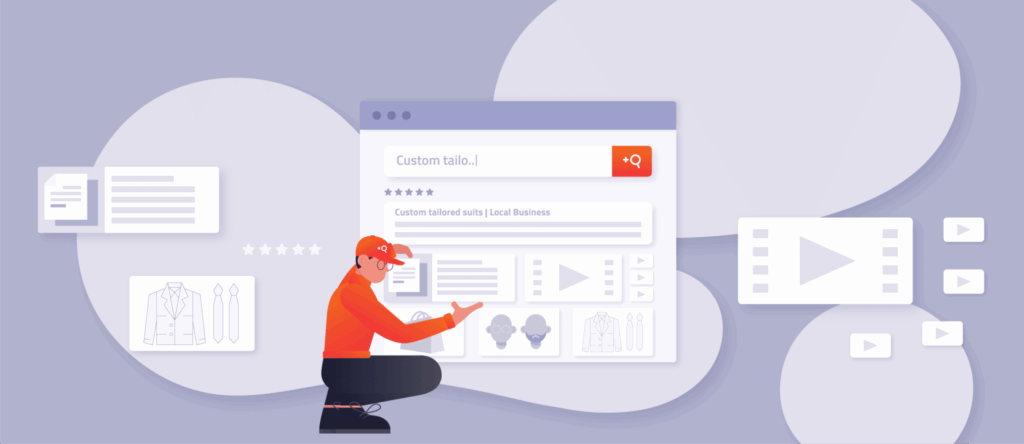
Do you remember being a kid on a slide in the playground? That moment just at the top, where after a slight hesitation or a second of uncertainty, you launch yourself off, and it is glorious. The wind’s in your face, you’re picking up speed and whizzing toward your friends – and then it strikes – the dreaded friction burn. Your legs are on fire, and the fun evaporates. Each of your customers can be that kid: starting off their journey on your website with trepidation, searching for information, gaining momentum – then often hitting a wall of pain.
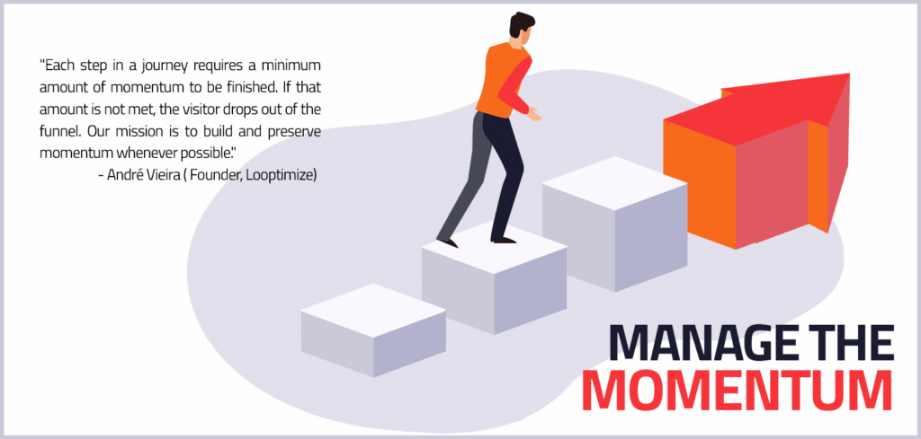
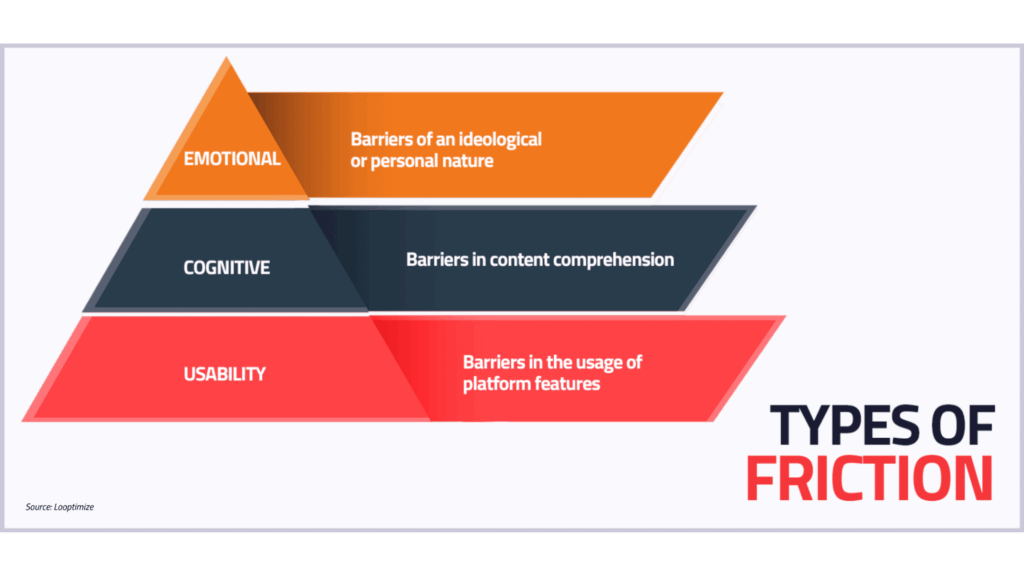
So how can you take away the obstacles and make sure they keep moving long enough to fill their cart and click ‘buy’? André Vieira, Founder of Looptimize, shared with us the three types of friction that slow your customers down when they search for a product, eating into the momentum they need to take the next step on their purchasing journey. Each time a prospect runs into friction on your website, you risk losing them. So let’s explore how you can fight the friction to keep them from dropping out of the funnel.
Why is your website losing customers?
1. Your website doesn’t help visitors get the job done.
Usability friction is all about how difficult your interface makes it for visitors to do what they want or need to do. The easier it is for customers to find and use your website’s features, the more likely they are to complete their buying journey with you.
To figure out if you have a problem with usability friction on your site, check how intuitive it is to use:
- How forgiving is your search? Would a typo leave your prospect stranded with no results and, therefore, nothing to buy?
- Do your features do what customers expect: This study found that customers tend to reach for a submit button on the right of a site search field (even if it isn’t there). Also, modern and creative icons make great visuals, but is it clear what clicking them will do?
Doing it right:
Help your customers complete their journey by removing any usability obstacles in their way. Allow for human error, test for natural tendencies, and smooth out the path with easy-to-follow steps, instructions, and visuals.
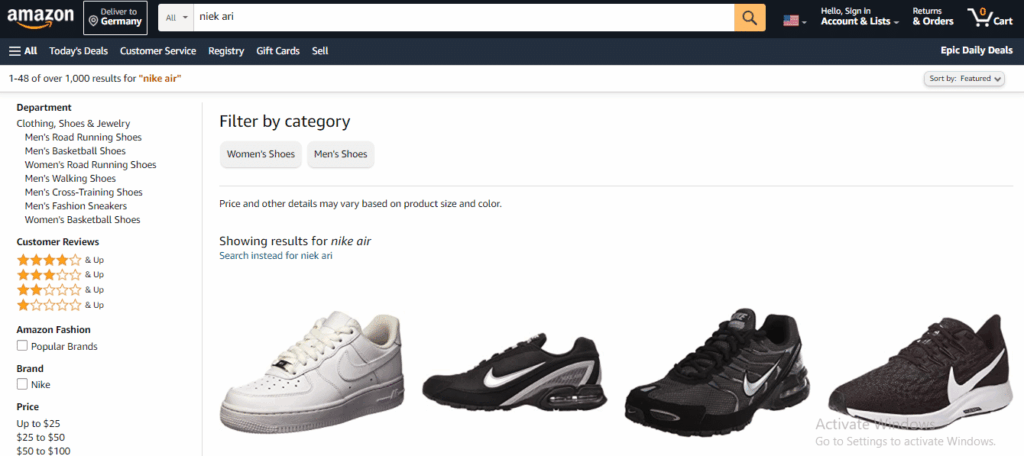
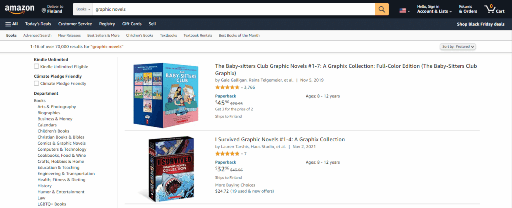
For example, Amazon’s site search has a handy submit button, satisfying the subconscious drive to press or click it. It also accommodates misspellings to give prospects suggestions for the next step they can take and keeps them moving along their search journey all the way to purchase.
2. Your site is too confusing.
In an already stressful and information-heavy world, you would have to be pretty invested to keep going with a process that makes you think hard every step of the way. Give your visitors a break by making their next step easy to find and understand. In other words, reduce the cognitive friction on your site.
- How much thinking and sorting does your customer need to do: Does your website contain a ton of information that takes away from the user experience? Are your search results – and even your search bar – in places that your customer wouldn’t expect to find them or can’t spot them at first glance? When your search bar is hidden away, that’s one more thing they need to look for before they can get their answers. Do you have external ads on your site, and do your visitors have to look past them to find your products or services?
Doing it right:
Reduce the cognitive load on your website by setting expectations, showing the number of search results, and color-coding or using clear icons to separate different types of information. Help customers explore your offering in depth by giving them the option to sort or filter information. Surveys can help you uncover where the most confusion comes from and fix it quickly.
Amazon helps customers see at a glance how many results they might have to sort through to find their product and gives them the ability to help themselves by narrowing the field with easy search filters.
3. Your site doesn’t feel cohesive the whole way through.
Your visitors need to stay excited about your brand and products all the way to the cart. If the feelings they get along the way don’t match your brand, or they aren’t getting relevant results when searching your site, emotional friction makes them hesitant and they lose momentum.
- How does your website make your customers feel? Does it get them excited about your products and services? Does it entice them into the search process by offering a path to try even before they know exactly what they’re looking for? Are the options you offer relevant to the stories they’ve already been told?
- Does the journey create negative feelings: Is there evidence for your product ratings? If not, it could make customers wonder if they’re legit and affect their trust in you. Are you interrupting their mission? No promotion is more important than the search they’ve already started.
Doing it right:
Keep the excitement and momentum going by planning pathways for uncertain customers that pique their curiosity, reducing sticking points and interruptions that distract customers, and sharing the love from existing customers with prospects.
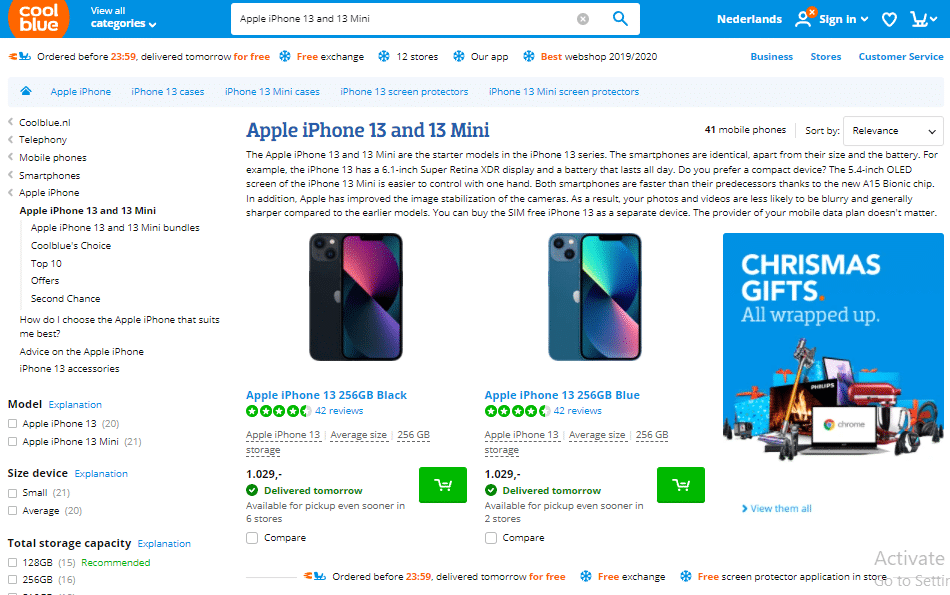
From the moment you land on their site and click on their search bar, Coolblue gives you some choices to play with by showing you their five most popular searches. Since you haven’t given them any information yet, there’s a good chance that you could be looking for one of those, and it can get you started.
Social proof is front and center on their site too, since the ratings are clearly shown in the search results along with the number of reviews each product has. They even help you find their customers’ favorites faster by listing the products with higher customer ratings first. People love seeing social proof because it tells them others liked these products too, without having only a biased description from the seller to rely on.
Small changes can get you big results, so take a closer look at how your website search helps customers find what they are looking for. Once you open your eyes to the sources of friction, you will keep seeing new ways to keep that momentum driving your visitors from your home page to checkout. Keep fighting the friction!
How can we help?
Want more tips just like this? Our CEO, Helena Rebane, and André Vieira, Founder of Looptimize teamed up in our free webinar “Friction in Your Website’s Search Journey: What to Look Out For?” to help you think about your search user experience and maximize your customers’ momentum and get them smoothly to the finish line. Watch it now for André’s detailed checklist to help you fight each type of friction.
As André mentions, a tool like AddSearch can solve 50-70% of your friction issues straight out of the box because we’ve already thought about them for you and equipped you with solutions like dynamic search queries. Let us help you get your website visitors from the first click to conversion by smoothing out the friction in your customer search journeys. Talk to our team today or sign up for a free account to try it out for yourself.
